Allows user to investigate how the individuals contribute to the principal component analysis (PCA).
This sub-tab focuses on the results for the individual samples (observations, rows) in your dataset within the principal component analysis. It helps you visualize how your samples are positioned in the reduced PCA space and understand their relationships based on the principal components.
This section within the Individuals sub-tab provides scatter plots visualizing your individual samples (rows) in the reduced principal component space. These plots help identify sample clusters, outliers, and relationships based on the principal components.
(Note: While sometimes referred to generally, the term "correlation circle" specifically applies to the plot of variables. The plots below show individuals positioned by their PC scores.)
Available Plots
Individuals Plot (Colored by Quality/cos2):
What it shows: A scatter plot where each point represents an individual sample. The X-axis is typically PC1, and the Y-axis is PC2 (though you can change this in the setup). Points are positioned based on their scores on these PCs.
How to read it:
Position: Samples close to each other in the plot have similar profiles across the selected principal components.
Color (cos2): The color of each point indicates its quality of representation (cos2) on the plotted dimensions. Warmer colors (e.g., red/orange) usually mean higher quality (the sample's variance is well captured by these PCs), while cooler colors (e.g., blue/green) mean lower quality. Points with high cos2 are reliably positioned; points with low cos2 might be better represented in other dimensions.
Distance from Origin: Similar to variables, individuals further from the origin generally have a stronger signal or variance captured by the plotted PCs (often correlated with higher cos2).
Individuals scatter plot colored by cos2
Grouped Individuals Plot:
What it shows: The same scatter plot as above, but points are colored and/or shaped based on the Grouping Variable you selected during the PCA setup (e.g., treatment group, cell type).
How to read it:
Groups: Visually assess if samples belonging to the same group cluster together. Clear separation between groups suggests the principal components capture variance related to that grouping factor.
Ellipses: Often, concentration or confidence ellipses are drawn around each group.
Concentration Ellipses: Show the general spread of points within a group (e.g., covering ~95% of the points assuming multivariate normality).
Confidence Ellipses: Represent the confidence interval for the mean of each group. Non-overlapping confidence ellipses suggest a statistically significant difference between the group means along the plotted dimensions. (You can toggle ellipses on/off in the setup).
Individuals scatter plot colored by grouping variable with ellipses
Biplot:
What it shows: This powerful plot overlays the Variables Plot (arrows) onto the Individuals Plot (points, usually grouped). It allows you to visualize the relationship between samples, variables, and principal components simultaneously.
How to read it:
Points (Individuals): Interpret as in the Grouped Individuals Plot (position based on PC scores, color/shape by group).
Arrows (Variables): Interpret as in the Variables Plot (direction shows correlation with PCs and other variables, length relates to quality/contribution). Arrow colors often indicate contribution or quality.
Combined Interpretation: You can infer why individuals or groups are positioned where they are. For example, if a group of samples is located in the top-right quadrant, look for variable arrows also pointing strongly in that direction – those variables likely have high values in that sample group. Similarly, samples positioned opposite to a variable arrow likely have low values for that variable.
Ellipses: Show group distributions for the individuals, as in the Grouped plot.
PCA Biplot showing individuals (points) and variables (arrows)
This section within the Individuals sub-tab provides plots focusing on the quality of representation (cos2) for each individual sample in the principal component analysis. This helps you understand how well the position of each sample is captured by the principal components you are examining (typically the first few, like PC1 and PC2).
Plots for Assessing Individual Quality
Individual Representation per Dimension (Dot Plot / Heatmap):
What it shows: This plot displays how well each individual sample (listed on the Y-axis) is represented by each selected principal component/dimension (listed on the X-axis).
How to read it:
The color and/or size of the dot at the intersection of an individual and a dimension indicates the quality (cos2) of that individual's representation on that single dimension.
Darker/larger dots (e.g., dark red) indicate a higher cos2 value, meaning that dimension captures a significant portion of that individual's variance.
Lighter/smaller dots (e.g., dark blue) indicate a lower cos2 value for that dimension.
The color bar/legend shows the cos2 value scale.
Use: See which specific dimensions are most important for representing particular individuals.
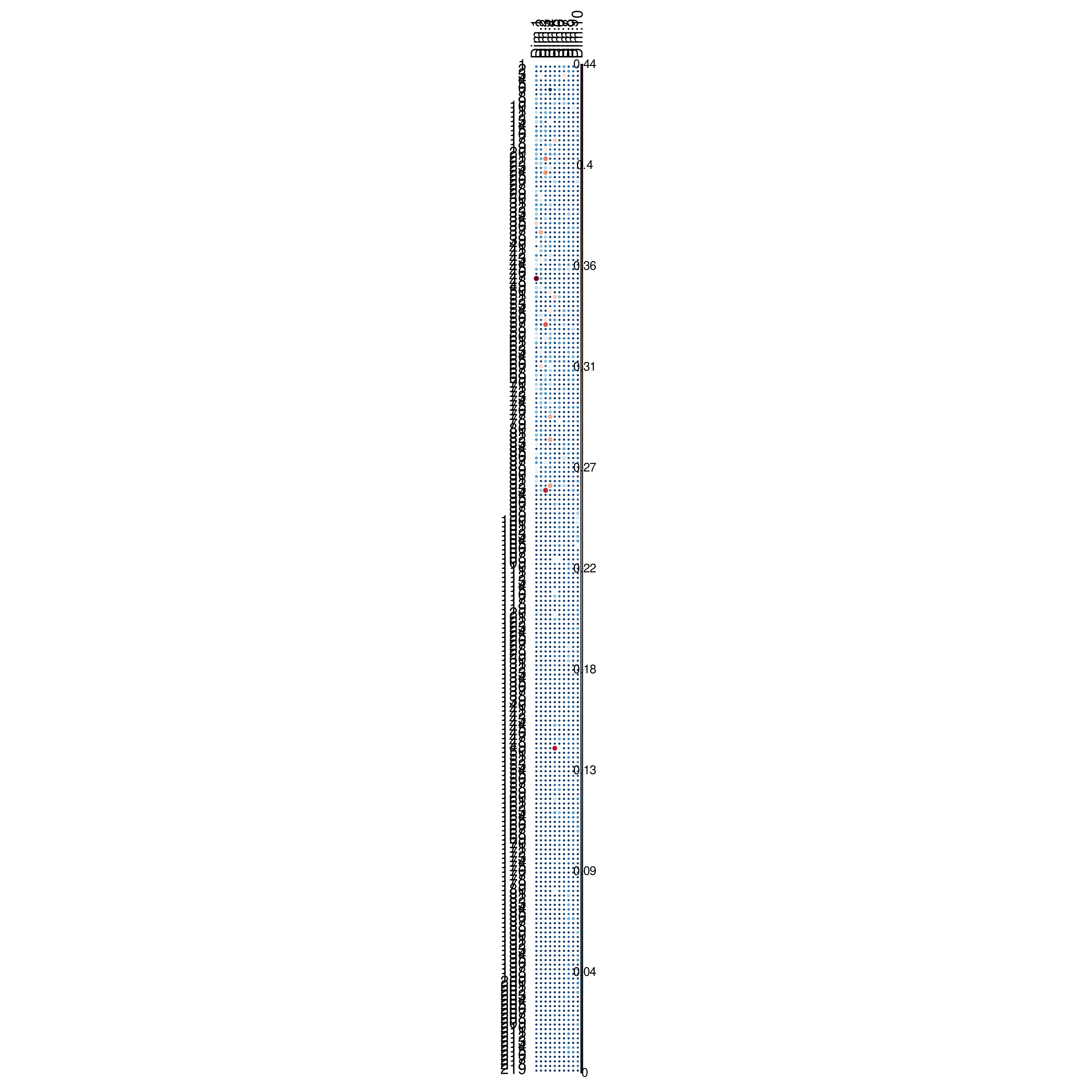
Dot plot showing individual representation (cos2) per dimension
Total Quality of Representation (Bar Plot):
What it shows: This bar plot displays the overall quality of representation (total cos2) for each individual sample, summed across the selected principal components (usually the ones plotted, e.g., Dim 1 and Dim 2). Individuals are typically sorted from highest cos2 to lowest.
How to read it:
Individuals with longer bars (higher total cos2) are well-represented by the selected principal components. Their position in the Individuals Plot scatter plot is reliable. These individuals often appear further from the origin in the scatter plot.
Individuals with shorter bars (lower total cos2) are poorly represented by the selected PCs. Their position in the scatter plot (often closer to the origin) might be less informative, as most of their variance lies in other dimensions.
Use: Identify which individuals' positions in the main PCA scatter plot are most reliable and which ones might be better explained by other principal components.
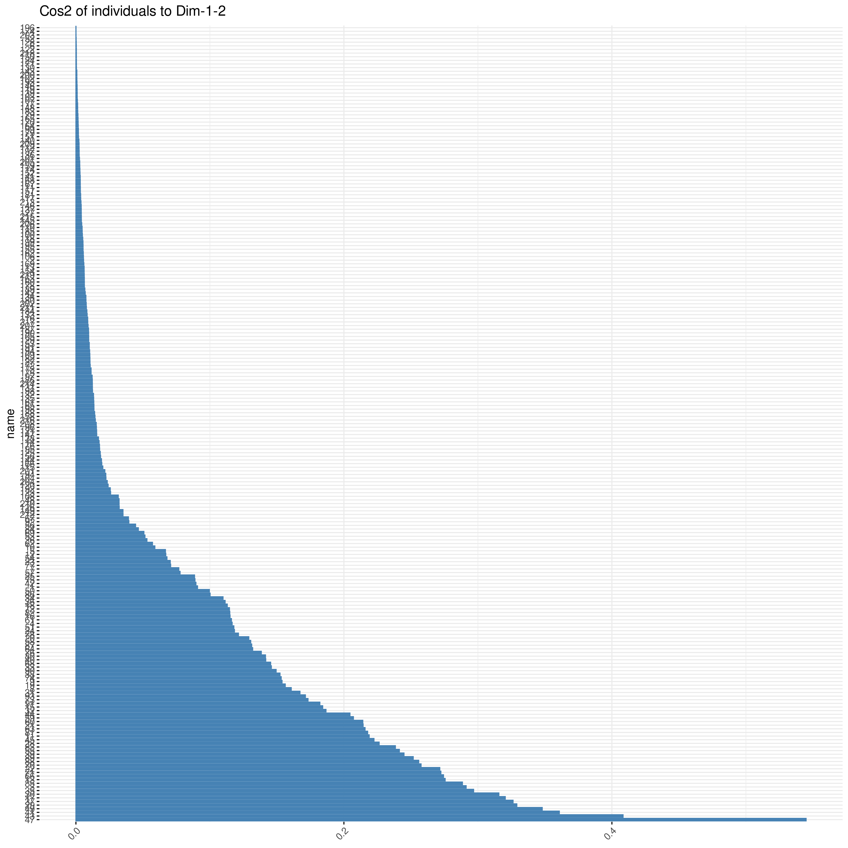
Bar plot showing total quality of representation (cos2) per individual
PCA Analysis: Individuals - Contribution to Principal Components
This section within the Individuals sub-tab focuses on how much each individual sample contributes to the variance captured by the principal components (PCs). Identifying high-contribution individuals can help spot outliers or understand which samples most strongly influence the direction of the principal axes.
Plots for Assessing Individual Contribution
Contribution per Dimension (Dot Plot / Heatmap):
What it shows: This plot displays the contribution of each individual sample (listed on the Y-axis) to each specific principal component/dimension (listed on the X-axis).
How to read it:
The color and/or size of the dot represents the percentage contribution of that individual to the variance of that specific dimension.
Darker/larger dots (e.g., dark red) indicate a higher contribution. Individuals with high contributions have a strong influence on that PC's orientation.
Lighter/smaller dots (e.g., dark blue) indicate a lower contribution.
The legend/color bar shows the contribution percentage scale.
Use: Identify which specific individuals are most influential for each individual principal component.
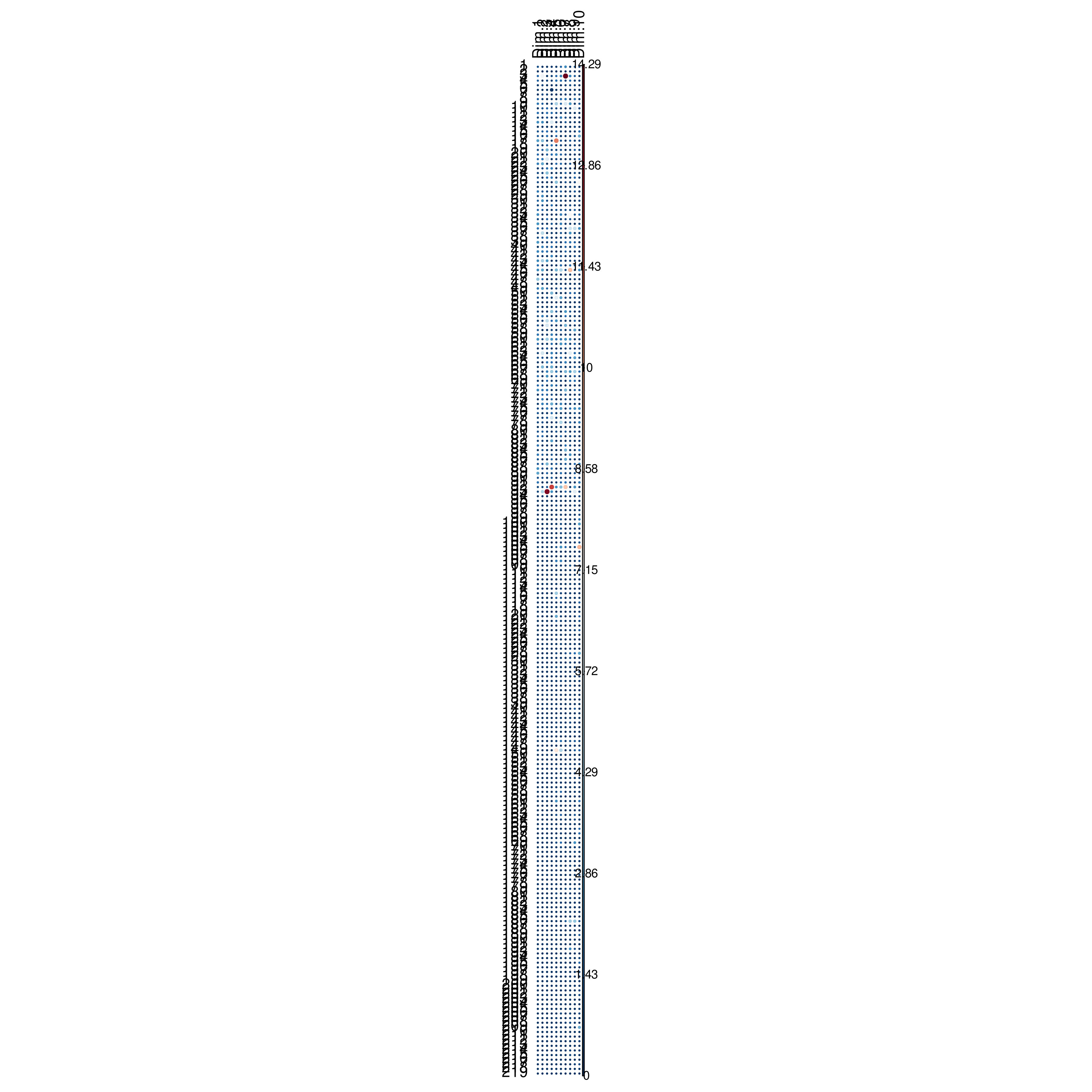
Dot plot showing individual contribution per dimension
Top Contributing Individuals (Bar Plot):
What it shows: This bar plot highlights the individuals with the highest contribution, typically summed across the selected principal components (e.g., Dim 1 and 2). Often, only the top N (e.g., top 10) contributing individuals are shown, sorted from highest contribution to lowest.
How to read it:
Individuals with longer bars contribute more to the variance captured by the selected dimensions. These might be outliers or represent extreme points within the data distribution along these axes.
The dashed red line often indicates the expected average contribution level if all individuals contributed equally. Individuals extending beyond this line contribute more than average.
Use: Quickly identify the most influential samples (potential outliers or key representatives) for the patterns observed in the main PCA plots.
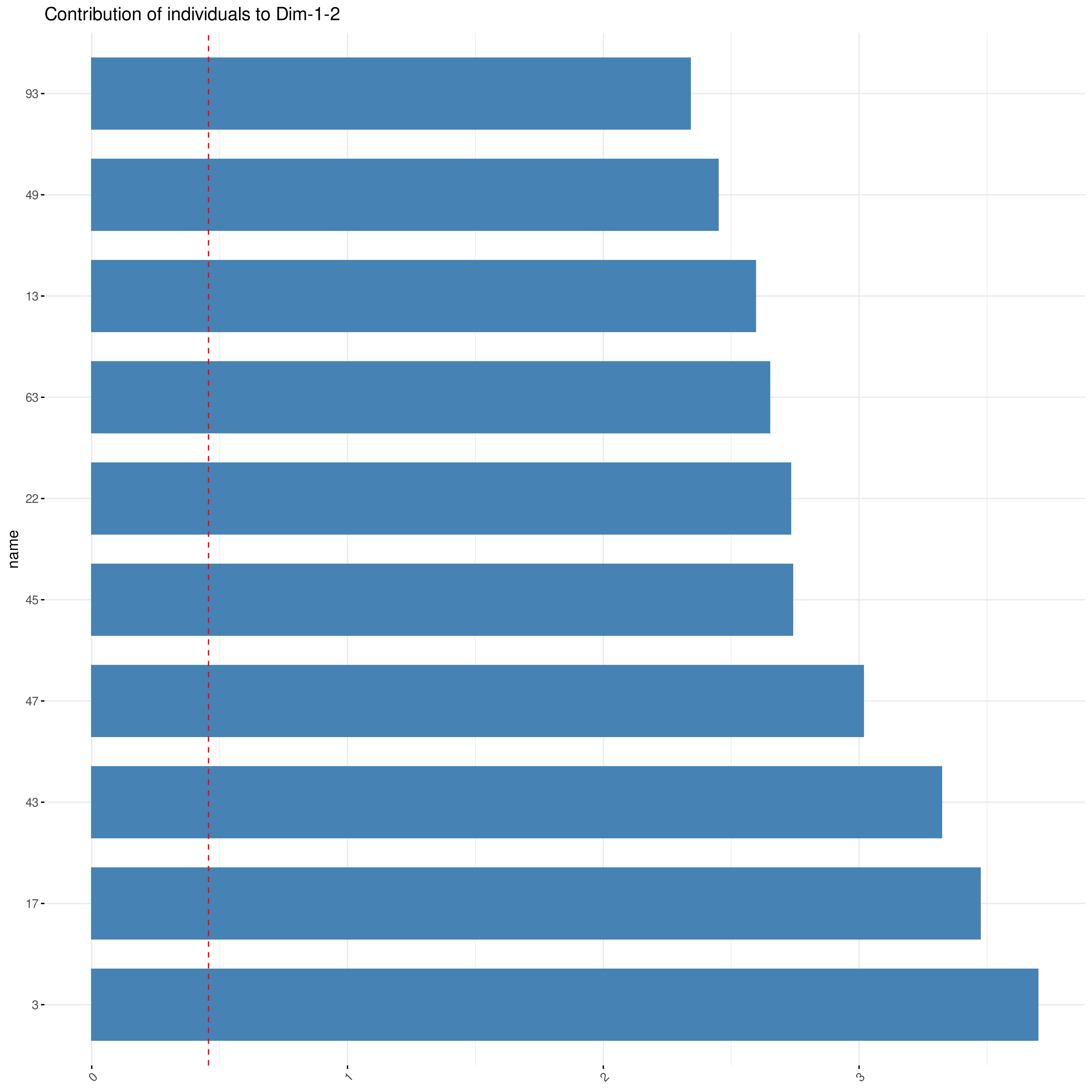
Bar plot showing top contributing individuals to selected dimensions
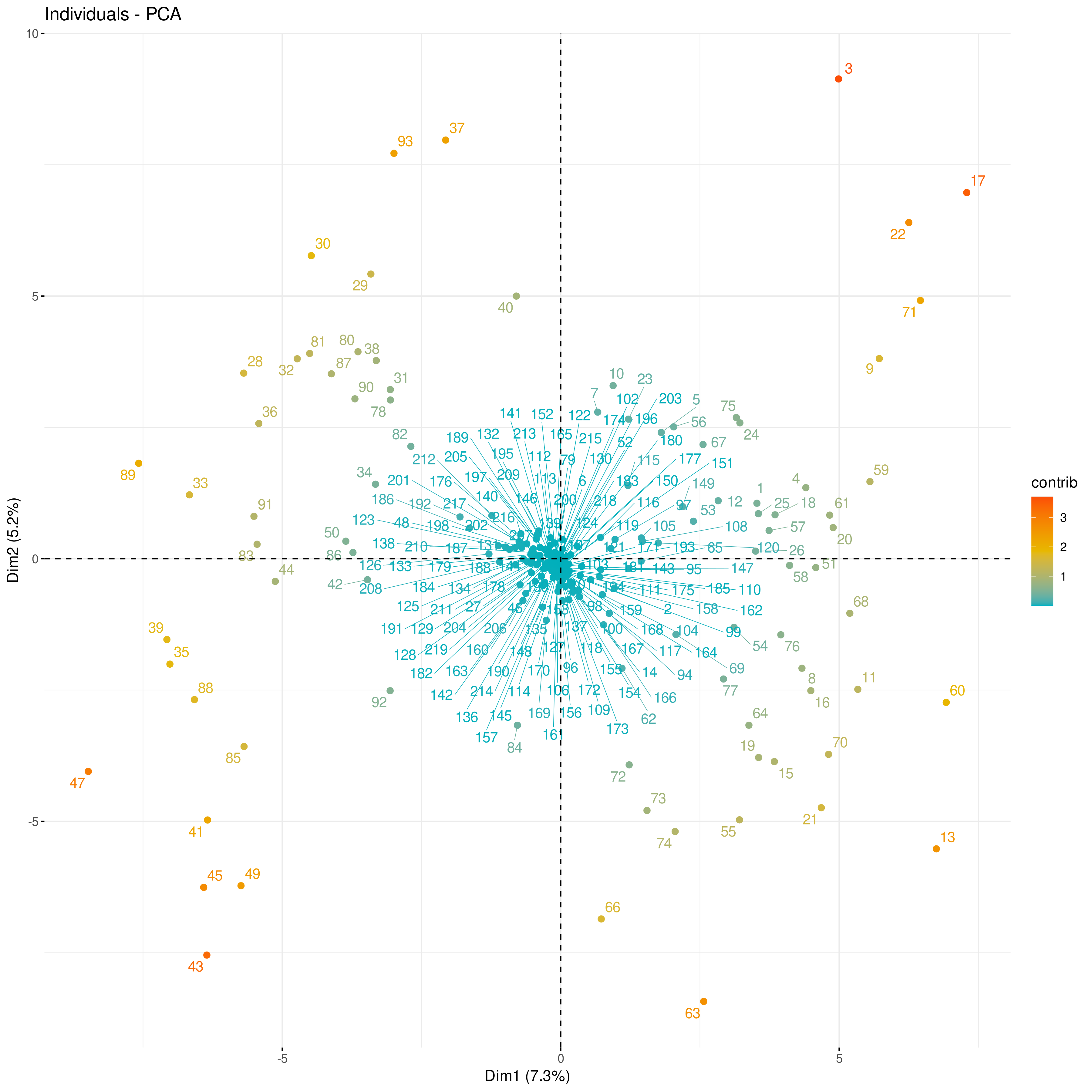
Individuals Plot (Colored by Contribution):
What it shows: This is the standard Individuals Plot (scatter plot of samples based on PC scores), but the points representing individuals are colored based on their contribution level (summed across the displayed PCs).
How to read it:
Warmer colors (like red/orange) typically indicate higher contributing individuals.
Interpret the position of points as usual (based on PC scores, revealing clusters or spread). The color adds information specifically about which individuals most strongly influence the PCs shown. Individuals far from the origin and brightly colored (high contribution) are particularly influential.
Use: Visualize sample positions and their influence simultaneously. Helps confirm if visually distant points (potential outliers) are indeed high contributors.