# Understanding distribution plots
### Why are distribution plots important?
When working with large datasets in biomedical research, it is vital to understand the structure of your dataset to inform downstream processes and analyses. Distribution plots provide information like correlation scores, variable distributions and pairwise data spread, which can inform data cleaning processes and analyses such as:
* Remove highly correlated features that may carry redundant information and cause multicollinearity in linear analyses or motivate use of dimensionality reduction.
* Determine predictive power of features to be used for supervised learning through correlation score
* Apply transformations or scaling for data columns that are heavily skewed or have significant noise or outliers
* Choose non-parametric models if the data does not appear to follow a normal distribution
### What do PANDORA's distribution plots show?
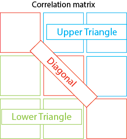
Generally, the distribution plot consists of three parts:
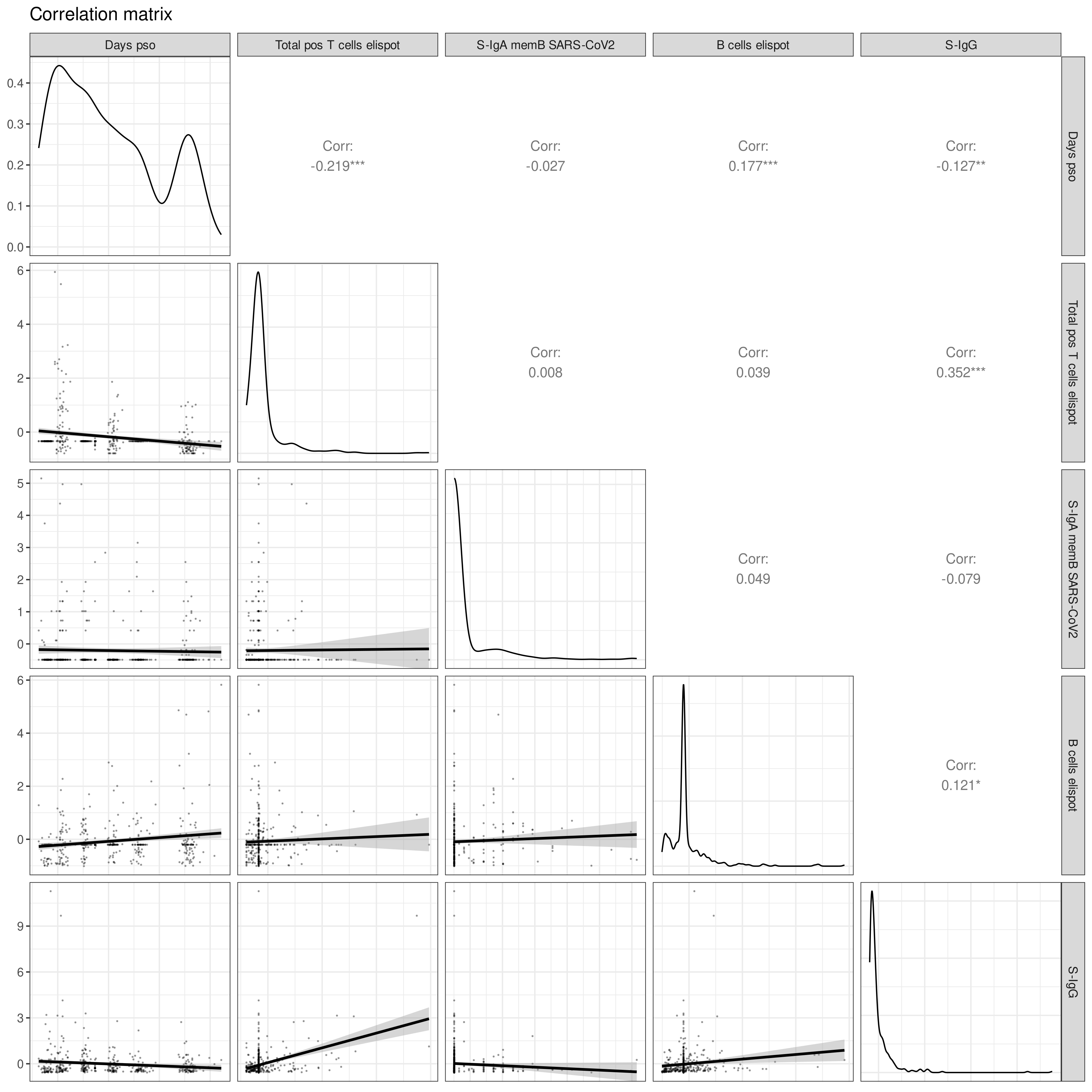
1. **Diagonal**: Distributions of each variable as density plots
2. **Lower Triangle**: Pairwise scatterplots between two variables with trend lines
3. **Upper Triangle**: Correlation coefficients, showing how each variable varies with the other
This can be showcased using numerical variables from the COVID Pitch dataset (`covid_pitch.csv` from [Introduction](https://atomic-lab.gitbook.io/pandora/example-workflows/example-2-sars-cov-2-infection/introduction)) such as days post onset of SARS-CoV-2 symptoms (`Days pso`), T and B cells ELISpots (`Total pos T cells elispot`, `B cells elispot`), and concentrations of various immunoglobin types (`S-IgA memB SARS-CoV-2`, `S-IgG`)
### How is the distribution plot different with categorical variables?
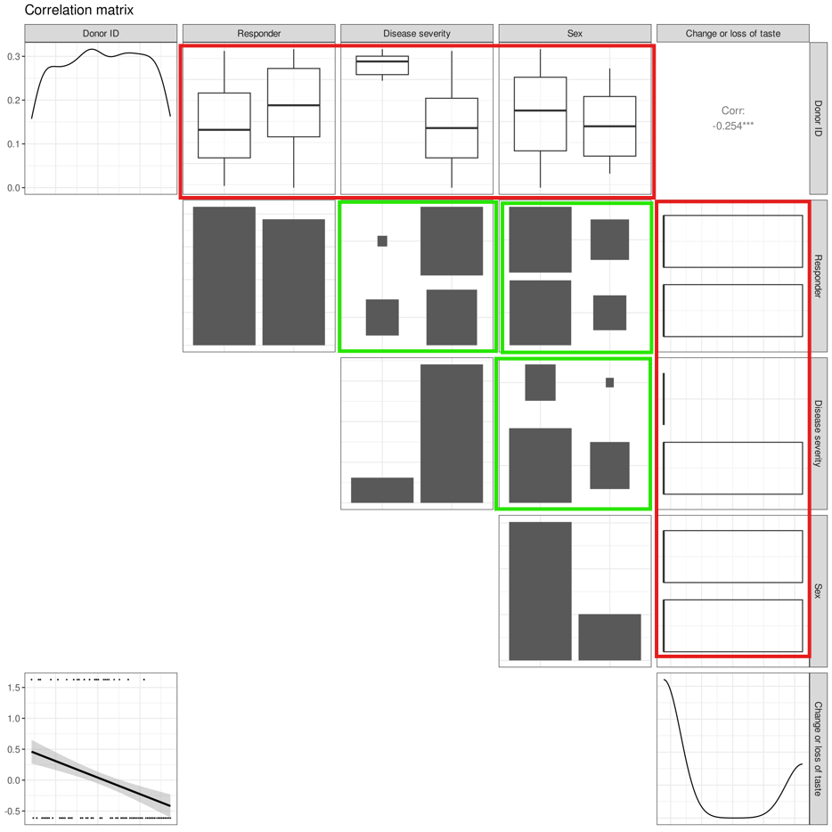
To illustrate the differences, we produce a plot with a mix of categorical variables (such as severity of SARS-CoV-2 disease symptoms, `Disease severity`, outcome of immune response durability at 6 months, `Responder`, and gender of participants, `sex`) and numerical variables (such as `Donor ID` and disease symptom `Change or loss of taste`)
Looking at the three subparts of the distribution plot:
1. **Diagonal**: Instead of density plots, categorical variables will have **histograms** that show the distribution of each category
2. **Lower triangle**: As there cannot be pairwise scatterplots produced between categorical-categorical variables or between categorical-numerical variables, we observe only one scatterplot between the two numerical variables `Change or loss of taste` and `Donor ID`.
{% hint style="info" %}
Since the pairwise scatterplot between `Donor ID` and `Change or loss of taste` shows points at the top or bottom of the graph, and the density plot of `Change or loss` of taste is bimodal, `Change or loss` must have **binary values.**
{% endhint %}
1. **Upper triangle**: The outputs in the upper triangle vary by the variable types being compared. Each possible output by variable type comparison is described below:
1. **Numerical to numerical:** [Pearson's r correlation coefficient](#user-content-fn-1)[^1] is displayed here, as it can only be calculated for comparisons between numerical variables. A star next to the number indicates there is a significant linear relationship between the variables
1. In this example, we observe only one correlation coefficient between the two numerical variables `Change or loss of taste` and `Donor ID`.
2. **Numerical to categorical:** Boxplots[^2] are produced to show how the numerical variables vary among different categories within the categorical variable (as highlighted by the red boxes in the image below)
3. **Categorical to categorical:** [Mosaic plots](#user-content-fn-3)[^3] are produced to show how the categories within a categorical variable vary with respect to categories in another categorical variable (as highlighted by the green boxes below)
### How to read these plots?
1. **Boxplot**: This plot shows the spread of the values within the numerical variable for each category of the categorical variable. For example, the two box plots in the box in row 1, column 2 show the spread of the timepoints based on high or low responder status. The spread is showcased through several parts:
1. **Median**: The line in middle of the box
2. **The box**: Interquartile range (IQR) showing the data between the first quartile (25 percentile) and third quartile (75 percentile)
3. **Whiskers**: The bottom whisker consists of the first quartile of data and the end of the line indicates the *minimum* value. The top whisker consists of the fourth quartile of data and the end of the line indicates the *maximum* value
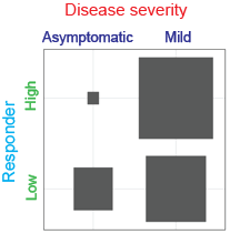
2. **Mosaic plots**: This plot shows the number of samples for each permutation of the categories present within the two categorical variables by the size of the box.
1. Example: Let us look at the plot between Disease severity and Responder in the image below (row 2, column 3)
1. As shown in the image above, `Disease severity` is split into 'asymptomatic' and 'mild', while `Responder` is split into 'high' and 'low'.
2. As we label the categories accordingly, we can see that
1. More high responders had mild disease severity compared to being asymptomatic, as seen by the notable difference in the size of the top bars
2. Slightly more low responders had mild disease severity compared to being asymptomatic, as seen with the less drastic difference in the size of the bottom bars.
[^1]: A statistical measure for the direction and strength of a linear relationship between two numerical continuous variables.
[^2]: Graphically shows the five number summary of the numerical variable's values associated with each category of the categorical variable.
[^3]: A visual representation of a contingency table that shows the joint distribution of two categorical variables.